Skip to content
Home Portfolio Brand Identity

Taupō Pure Sheep Milk

Taupō Pure Packaging: Sheepishly Good

Packaging Designed To Sit Pretty

A shelf-ready sheep milk can designed for brand consistency, clarity, and standout.

Taupō Pure is a local milk brand bringing sheep and goat milk from Taupō farms to store shelves, with packaging that needs to feel clean, premium, and easy to spot.

Legend designed a new can for their sheep milk product, making sure it sat naturally alongside the existing goat milk range while still having its own identity. The artwork needed to feel consistent, work within the packaging constraints, and keep the practical details like nutrition and product information clear and compliant.

The smartest part was balancing family resemblance with shelf presence. We studied the existing illustration style closely, built the new rural scene to match, and introduced a warm tangerine colourway to give the sheep milk can its own personality.

The result is packaging that feels unmistakably Taupō Pure, pops on the shelf, and makes the product easy to recognise and easy to buy.

Taupopure Farms
Taking Taupo Dairy To China
Brand Logos For Hero

Related Portfolios

A4 To Dl Brochure W Front

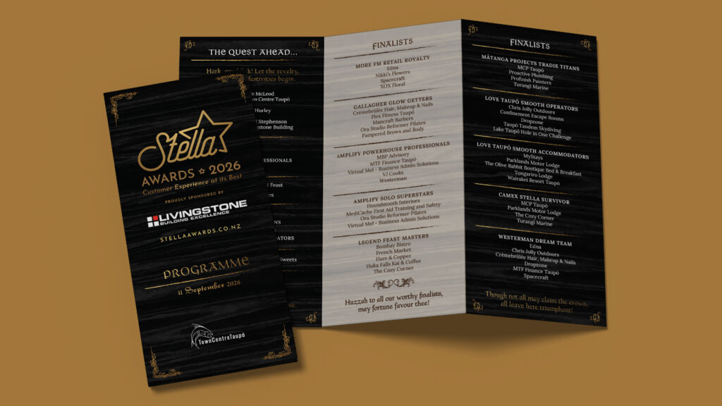
Collateral, Website, SEO, Graphic Design Stella Awards

A long-running creative partnership supporting the Stella Awards through website development, event artwork, promotional design, and sponsorship, all to celebrate Taupō's business legends.

Stella Awards
Staff Member Bagging Natures Flame Pellets

Graphic Design Nature’s Flame

Clear, practical design work for Nature’s Flame, turning complex factory processes, site layouts, and traffic flows into maps that are easy to follow and good enough to put on the wall.

Nature’s Flame
We Company Profile

Graphic Design Western Energy Company Profile

A polished company profile for Western Energy, presenting their geothermal services and case studies clearly - with a Japanese version created for offshore trade shows.

Western Energy Company Profile