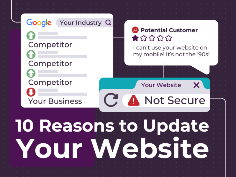
Submit works as a button label. Technically. Buuuuut it’s also not that great.
Buttons might be some of the smallest things on a website, but they do a surprising amount of heavy lifting. They tell people what to do next, where they’re going and, ideally, what’s going to happen when they get there.
That’s why we spend more time thinking about button copy than any reasonable person should.
The Problem With Generic Buttons
You see the same button labels everywhere:
- Submit
- Click Here
- Learn More
There’s nothing technically wrong with them. The problem is they don’t tell you much.
Take Submit.
Submit what? Where is it going? What happens afterwards? Am I sending an enquiry, requesting a quote or accidentally signing away my firstborn?
Good websites remove little moments of uncertainty like this wherever they can.
A button should make the next step obvious.
Tell People What’s Going to Happen
Instead of Submit, we might use:
- Get My Quote
- Book My Service
- Send My Enquiry
- Download the Guide
It’s a tiny change, but now you know exactly what you’re doing. The same thinking applies across the rest of a website. If someone is about to click something, the words on that button should give them a pretty good idea of what’s waiting on the other side.
We Do This All the Time With Forms
One of the first things we change when building a form is the default submit button. Nothing says “this came straight out of the box” quite like a big old SUBMIT sitting at the bottom, and that’s not our style. If you’ve just spent five minutes filling out a booking enquiry, Request My Booking feels far more natural. If you’re asking for pricing, Get My Quote makes sense. It’s a tiny detail, but websites are basically hundreds of tiny details stacked on top of each other, and getting them right makes the whole thing feel better.
We Need to Talk About “Learn More”
Learn More is another “favourite”. Sometimes it’s perfectly fine, but when a page has six cards and every single one ends with Learn More, we have questions. Learn more about what?
Someone scanning the page should be able to understand where a link is taking them without relying entirely on the content around it. That becomes even more important for accessibility, where someone using assistive technology may encounter several links with the exact same label. Six versions of Learn More don’t give them much to work with.
Compare that with:
- Explore Our Services
- View Tyre Options
- See Our Pricing
- Read the Full Guide
These labels give people more context about where they’re going and what they’ll find when they get there. That makes the next step clearer and helps them decide whether it’s actually relevant to them. Much better.
Good Buttons Remove Friction
That’s really what all of this comes down to: a good button shouldn’t make you think. You shouldn’t have to wonder where you’re going, what’s going to happen or whether you’re clicking the right thing. The words should make the next step clear and then get out of the way.
Changing Submit to Send My Enquiry probably isn’t going to transform your website on its own, but dozens of small decisions like this absolutely make a difference. Together, they make a website feel easier to use, more considered, more trustworthy and a lot less like someone installed a template and called it a day.
Tiny Button. Big Job.
We’ll happily spend an unreasonable amount of time debating two or three words on a button, because sometimes those words are the difference between someone taking the next step or not.
Book.
Buy.
Enquire.
Download.
Get in touch.
So yes, button copy matters. And if your website is still asking people to Click Here, it might be time we had a chat.